3 Unique Ways Chinese People Design Things

Today we’re talking about the nature of design in China. With a culture and history as long as China’s, you’ve got to expect that they have some pretty unique and ingrained design concepts going on - and you’d definitely be right.
From color choices to amazing engineering to eccentric Chinese web design styles, the overall look and feel of life in China is greatly impacted by the nation and its design choices, so we’re going to take a look at three key elements of Chinese design and try to sort out what makes them so Chinese and why.
Color Me Surprised
One of the first things you notice when you land in China is that things simply look different.
It’s hard to put your finger on it exactly, but it’s really about all the little things: wider streets in some places and narrower streets in others, buildings of mismatched heights, and unique house/apartment layouts are just some of the things that let you know you’re most definitely not in Kansas anymore.
For me at least, the most prevalent visual element was color.
Chinese designers think of color in a totally different way than most Western designers do, and it’s a pretty interesting window into the culture.
For one, you’ll notice red everywhere.
In the West red is certainly a key design element, but it has a relatively limited emotional range, usually connoting passion, love or fiery anger.
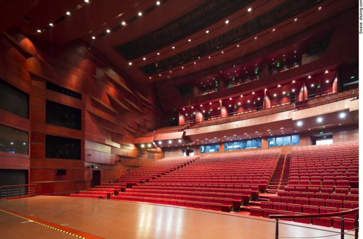
Here in China it symbolizes everything from birth to death to good luck to wealth and prosperity, so it’s used in an astonishing variety of architectural, interior and advertising designs. Just look:


There’s a joke in here about painting the town red but I’m not going to be the one to make it.

Anyway, part of this (arguably) excessive use of red comes down to a certain emphasis on directness and lack of subtlety in Chinese culture. Have you ever had a Chinese person tell you you look fat today? You can blame that on cultural differences and have that second piece of cake anyway ;)

Another interesting color element is the recent rise to prominence of a color referred to as tǔháo jīn (土豪金) ![]() , or “tuhao gold.”
, or “tuhao gold.”
Super-quick primer, “tǔháo” is a Chinese term that has come to refer to the nation’s nouveau riche, known to spend their newfound wealth in particularly tasteless, showy ways.
Tuhao jin is a type of gold color the came to prominence last year when Apple released a special gold iPhone in China that immediately became a must-have for the nation’s tǔháo.
Soon, Chinese netizens termed the gaudy hue “tuhao jin,” and the color quickly became a defining design element of China’s new wealth.
It’s used frequently in advertisements and other materials intended for a newly-wealthy audience, and is indicative of the interesting way color carries weight in Chinese culture differently than it does in the West.
Web Design Craziness

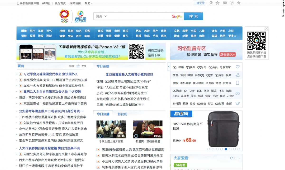
If you’ve never visited a Chinese website intended primarily for domestic consumption, check out these examples.
Does that design style look cluttered and overwhelming to you? But these are some of the most popular sites in China and get as many if not more hits than famous Western websites.
How is this possible? Chinese web design is a bizarre animal, but it’s bizarre for a reason.
For one, these sites look a little crazy to us in part because of the language difference. Even for those of us who have studied Chinese for years, it’s tough to comprehend a wall of Chinese character text upon first glance, and there’s still a bit of an immediate intimidation factor no matter your comfort level with the language.
The fact remains, though, that there is an overwhelming amount of text and little to no graphics or guiding menus, not to mention frequent pop-ups and other interruptions.
As one American web designer working in China put it, “they regularly practice many of the fundamentally understood bad design principles that Western designers strive to avoid at all costs. I honestly felt like I was back to 1995 all over again.”
I can confirm, surfing the Chinese web often does feel like Clinton’s in office and we’re all wearing acid-washed jeans and listening to Boyz II Men and C&C Music Factory. So, what’s the story?
One theory is that the way Chinese people tend to absorb and process information is different in many ways from how Westerners do.
My personal observations as well as some research suggest that Chinese students (and really East Asian students in general) are trained to absorb the maximum amount of data upon sight and then analyze and interpret later, whereas in the West we tend to try to interpret and apply information right away.

As such, Chinese websites put a premium on showing as much information as possible because that’s what the Chinese audience prefers and interacts with best. I think it’s fascinating how this design feature reflects ingrained cultural traits!
I’ve noticed that this is gradually beginning to change, however.
Two of the most popular e-commerce sites in China, for instance, are the all-mighty Taobao and 京东 (jīngdōng) ![]() , both of which feature very modern, clean-looking web designs that aren’t especially distinct from their Western counterparts.
, both of which feature very modern, clean-looking web designs that aren’t especially distinct from their Western counterparts.
Is this a sea-change in the way Chinese netizens process information from websites? Or just a gradual globalization of Chinese web design?
Either way it’s an interesting interaction between design, culture, business and technology.
Engineering

China’s high-speed railway lines were all over the headlines a few years back, and for good reason – they’ve made travelling between the country’s large cities much faster, easier and cheaper (imagine taking a train from New York to Chicago in 5 hours for $90, and you only have to show up at the train station 10 minutes before departure! That’s what the Shanghai-Beijing train is like).
The experience of taking the trains feels pretty different from what it’s like to take a train in the US or Europe, though.
It’s hard to really explain, but there’s a certain uniformity to the entire system – every station pretty much looks the same, all the trains themselves are identical, etc.
This is, in many ways, a uniquely Chinese approach, as Chinese design and culture tend to favor central planning over other methods.
In the US, rail lines and stations were all built at different times, lending each rail experience a distinct feel, but in China, they’re all the same – for better (simplicity/convenience) and for worse (boredom).
Another interesting aspect of Chinese design that you can see in the train system is the affinity for shānzhài (山寨) ![]() - knockoff/imitation culture.
- knockoff/imitation culture.
When you can buy 100 kinds of fake iPhones and handbags in a country, it leads to some interesting design quirks at the industrial level.
Because China is a relative late-comer to the high-speed rail game, for instance, it has had the chance to piece together the best parts of other country’s system to create a uniquely Chinese rail system.
In a sense, it’s like a knockoff of something other countries are producing, but rather than just being a cheap imitation, it’s their best shot at emulating the "diǎnxíng (典型)" ![]() , or optimal/original example.
, or optimal/original example.
Harvard University railway expert Har-Ye Kan talks about “principle of emulation that is intrinsic to the Chinese culture: to model itself after what it deems as the classic exemplar.”
Have you seen any crazy or cool instances of design in China? Leave 'em in the comments below!
 MICHAEL HURWITZ | FEBRUARY 22, 2014

 Chinese Is Easier Than You Think
 What Is Pinyin?
 An Introduction to the Tones
 The 1st and 2nd Tones
 Numbers 0-10
 🐎 2026 Year of the Horse: Meaning, Culture & Chinese Expressions for Learners
 Learn Chinese Pronunciation RIGHT with the (FREE!) Yoyo Chinese Interactive Video & Audio Pinyin Chart
 [LIVE] How to Read a Chinese Menu 101
 [LIVE]: How Chinese People Actually Speak
 Did You Know You Can Use Yoyo Chinese Like a Mobile App?
 Why do non-Chinese people feel that Chinese is difficult to learn?
 An Untold Love Story of Me and Yoyo Chinese
  6 Awesome Authentic Chinese Foods You Need to Know About
 Frequently Asked Questions About Chinese
  5 Things Chinese Women Love About Western Men
 Chinese Insults: How to Name-Call Like a Pro (Part 1)
 Tone Pairs - The Mandarin Language Hack You've Been Waiting For